Bad Graphs in the Wild
I recently used this example as a source of interview questions, so I thought it would be worthwhile to write it down.
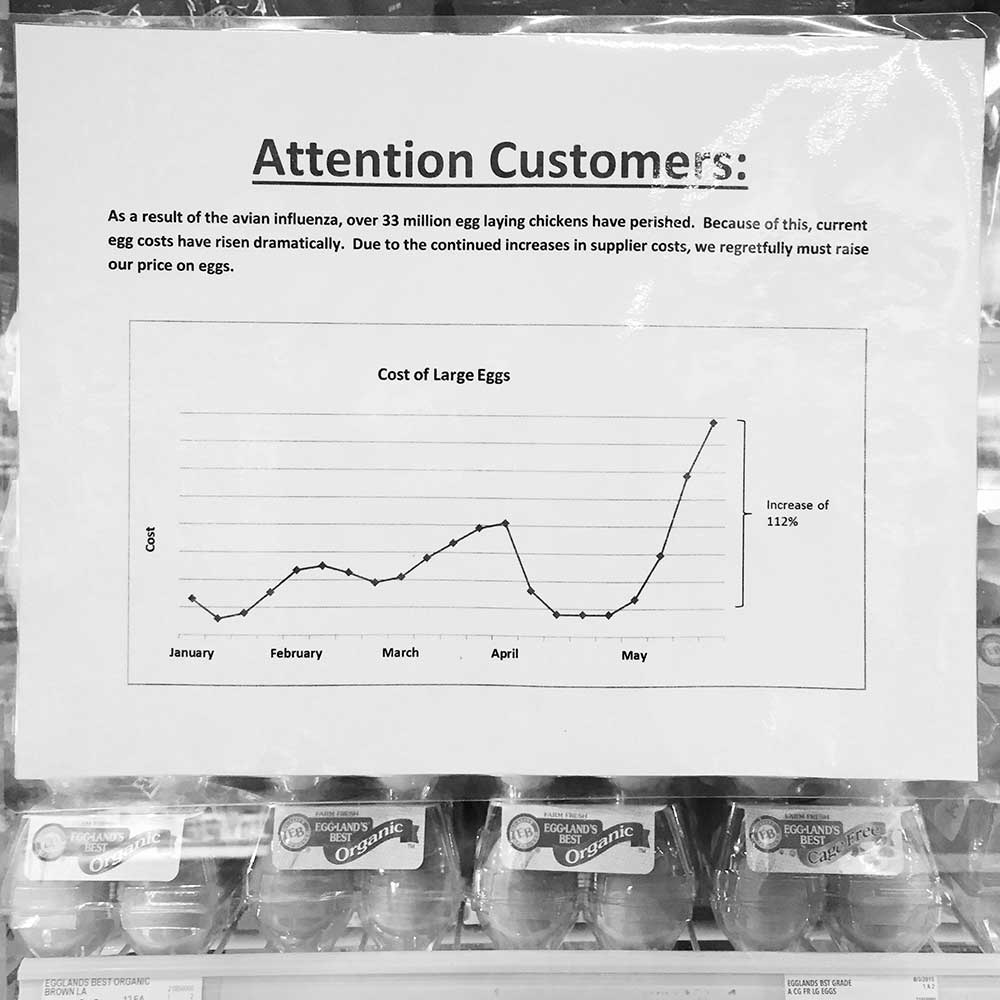
At the grocery store yesterday, I found this laminated graph in front of the egg refrigerators. I laughed out loud and immediately snapped a photo. There were other people around me and they seemed confused by my photography - hopefully they didn’t think the graph was helpful! I know the photo is only black and white above, but the printing was only black ink on white paper anyway.
I think this “informative” data is intentionally misleading.
- Why is there no Y-axis unit? Is the unit “Cost?”
- What is the baseline for the Y-axis? One dollar? 0%? One half of a Euro?
- Is the unit spacing on the Y-axis linear or logarithmic or exponential or something else?
- Why are the months on the X-axis unevenly spaced?
- What is the relative price change in other goods? Maybe all food has risen in price the same relative amount.
- Avian influenza is mentioned. When did that affect the price of eggs? There is no time of inflection.
- Does this data belong to this year?
- It is now nearly the end of August. What has the price been like the last 3 months?
- What is the source of this data?
It was a fantastic source of questions for potential data visualization engineers today!
Reference
| ← Previous | Next → |
| On Reading Fine Structure | New Hires are a Valuable Resource |